ShopDreamUp AI ArtDreamUp
Deviation Actions


Suggested Deviants


Suggested Collections


You Might Like…


Featured in Groups


Description
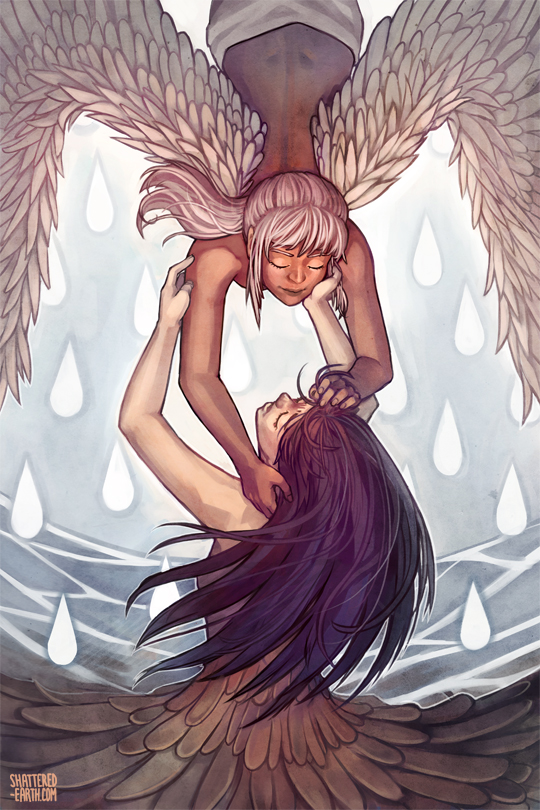
You are the air that I breathe
Without you I am incomplete
You are the only one for me
Original print for Otakon inspired by the song Redline Day From the anime movie Redline. It was based on this sketch which was for a sketch a day thing, omg so many seperate origins XD! I kind of like the sketch better though /sob
I put this on critique requested, but there are mistakes/intentional distortions that I want to point out too (so there's no need to repeat them unless you disagree lol). The wings first of all, are not accurate to life at all. The pose was already messed up from the sketch so i just went all out for stupid-anime wing anatomy. The dress I didn't know how to do right :/ It was originally going to be just a flower type dress, but then i thought it would be cool to make it look like dirty brass, but i just didn't do a very good job polishing it up. The black hair girl's right arm is also weird too.. just.. weird <_<.. hell i'm sure all the arms are weird! In retrospect i should have removed the white hair girl's boob completely too LOL, spines don't work that way >_> <_< (geez maybe i should edit this before final prints eh LOL)
Purchasable as as a print from here: [link]
Image size
540x810px 374.94 KB
© 2012 - 2024 Shattered-Earth
Comments62
Join the community to add your comment. Already a deviant? Log In
Just to start, I would like to say I like this piece a lot <img src="e.deviantart.net/emoticons/s/s…" width="15" height="15" alt="
The vision is overall exceptional <img src="e.deviantart.net/emoticons/s/s…" width="15" height="15" alt="
Originality is fantastic. I have yet to see a piece like this one. Your association of feathers and a water-droplet back round is unique.
Technique is exceptional as well. Like I said before, the lighting/shading seemed a bit unnatural. As much as I like the back round, I feel it should either be a much darker color, or a much lighter color.
Does this impact me? Yes, very much <img src="e.deviantart.net/emoticons/s/s…" width="15" height="15" alt="